Friday 25 February 2011

veneer


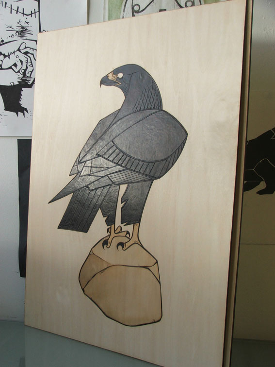
Dawn has been on at me to play with some veneer for a while so i finally relented and got some off-cuts. i was intending to look into the prospect of printing on it (which i still might) and hadn't really considered using it in a more conventional way. i had a bit of creative block at the studio trying to come up with ideas for new prints so i thought id have a go at inlaying the veneer in birch printing ply. it went better than id expected and im going to experiment more with this technique. the process sparked an idea too which im going to have a crack at. stay tuned!

Northern Something.


here's a new woodcut. its a reduction print which means that the same block is used for each of the colours and after each colour is printed, more of the block is cut away to print the next colour. this is achieved by working from the lightest colour towards the darkest. for example, in this instance the lightest colour is the white of the mammoths tusks and eyes (the paper.) before any printing, everything we want to keep white is cut away from the block and the first colour is printed; in this case yellow. next, everything we want to keep yellow is cut away i.e. the background, and the next and final colour, black, is printed.
et voila; a three colour reduction print (if im sly and include the white!)

'northern something' is a track by tortoise which was echoing around my head when i made this print. i think there is some significance in it.

buy print
play 'Northern Something' by Tortoise (loudly!)

Tuesday 15 February 2011

more layers of stain...


something fishy


heres another commission which is in the pipeline. another pyrography piece using tea/coffee stains and watercolour (next).
the piece is done over three panels which will be joined together to form one long piece which will hang in a stairway. the final piece will be muted colours, but i have to say that i very much like the quality of the branded lines in combination with the coffee stains and intend to create work in the future which is rendered in this way omitting the colours. its graphic, but sepia and textured, which i think is a nice contrast.
once the piece is framed, joined and all that nasty bowing is pulled straight ill post some more images. in the meantime, its another 10 or so layers of coffee stains to create the tones.

father and son.


a fine gentleman patron of mine decided to commission me to make a pair of pieces for his dads 60th birthday. he was after a golden eagle and an otter; pyrographs, facing each other. here are the results, and please excuse the ropey photographs. we are still in discussions about framing, i hope he likes them!

IM BACK!

after a serious hiatus from blogging ive decided its time to get back into it. not so much a new-years resolution as it is mid-way through february now, but something similar.
a lot has happened since my last post both with my work and in my actual life, but im not going to try and recount it all, just resolve to make a bit more effort to keep it up.... starting with current commissions which im just tying up....